September 21, 2021
Scaling ChargePoint web application development with cp-toolkit
The engineering web team at ChargePoint is responsible for building web applications that are used by charging station owners, EV drivers and internally across our organization. Each of these web applications uses a shared component library as a way to standardize and speed up development. Our component library, called “cp-toolkit”, was built from the ground up using React, TypeScript and styled-components.
The library is implemented as a collection of reusable React components that are optimized for use across desktop, tablet and mobile applications. Although cp-toolkit is only available internally at ChargePoint, we are building out several web applications with it. This library is well-documented, actively maintained and ready for internal use.
The toolkit has fundamentally changed the way we scale front-end engineering by providing a consistent way to apply unified designs across multiple applications and teams. It makes developing software easier, more productive and more fun.
Background
Since ChargePoint was founded in 2007, our web applications have been built using primarily PHP. PHP frameworks may have been cutting-edge a decade ago, but they have become monolithic, difficult to maintain and very slow to develop and scale over time. Today, the modern web development tech stack allows for much quicker iteration and scaling of production-ready websites.
Over the last year, we’ve started decoupling our services and applications so we can stop adding more and more code into our monolithic code repos. This has allowed us to quickly build applications for our external customers and internal use within ChargePoint.
As we started designing new web applications, it became apparent that much of our existing work was siloed and not easy to reuse. Different teams within ChargePoint were not able to leverage one another’s work, causing teams to build one-off solutions and forcing UX, product and engineering teams to reinvent the wheel over and over. As a result, our ecosystem of applications lacked a cohesive user experience and development process was inefficient.
Recognizing that these inefficiencies were holding us back, we started planning a design system that would be consistent and able to be deployed across multiple teams here at ChargePoint. As this project developed, engineers collaborated with our UX and product teams to build the foundation for our shared component library, cp-toolkit.
Our goal for cp-toolkit was to build a design system (think of it like LEGO building blocks) that would allow us to:
- Build reusable components. We wanted to define a common set of reusable components that not only define the look and feel of software, but also provide a framework for how these components work together to provide a quality user experience throughout any of our web applications. This frees our designers and engineers from recreating the same work and allows them to focus their time and efforts elsewhere.
- Share tools between UX design and engineering. Tools and standards should help engineers and UX designers communicate and review design mockups more efficiently. By defining typography, color palettes and layout constraints, engineering can take a design and quickly build a working example to share and review in real time.
- Create consistent user interfaces. By leveraging a shared component library that is built upon an established design system, we ensure consistently excellent user experiences across all applications and services in the ChargePoint ecosystem.
- Improve code quality. Shared components allow us to write code once and reuse everywhere. We may spend more time implementing each component to the highest quality standards, but it takes much less time to integrate them into our many applications and internal services.
Architectural principles
The architecture of cp-toolkit is guided by the following principles that our engineering team believes are critical to the success of a shared component library.

Development experience
We decided early on that our tech stack should consist of well-supported, open-source projects that are easy to install and get up and running as quickly as possible in a local development environment. This led us to build our shared component library in React, using TypeScript and styled-components. We decided early on to build the design system from scratch as opposed to building on top of a third-party design system like Bootstrap or Material Design, in order to minimize the size of our component library.
Components and composition
Each component is built to do one thing, with reusability and composition in mind. Think of a component as a particular type of LEGO block. Each LEGO block or component has one particular use, but when combined, the blocks can build something beautiful. These components are the foundation of our design system and user experience.
Example components:
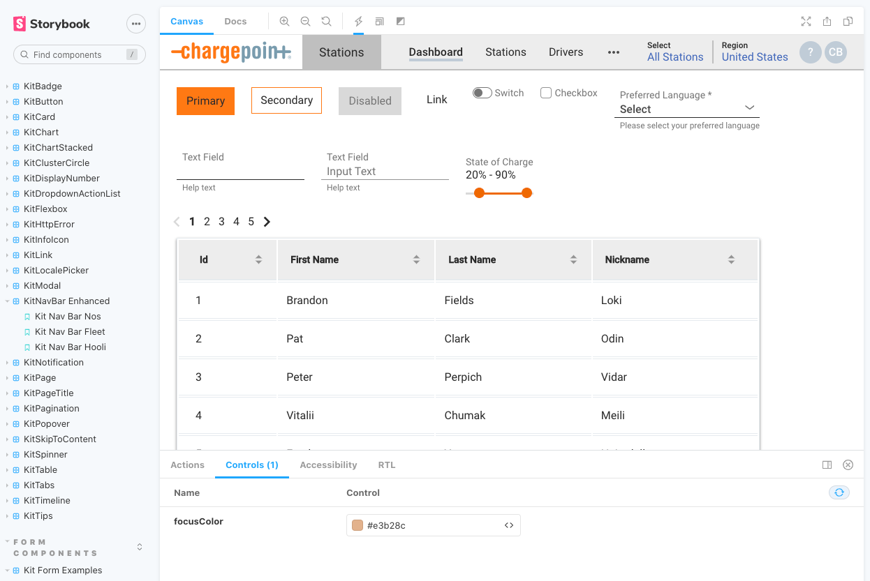
| Component | |
| KitSelect |  |
| KitTimeline | 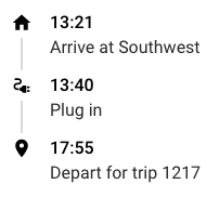 |
| KitSlider |  |
Accessibility
Too often, accessibility is as an afterthought in web application development. This is why we decided to have support for accessibility baked into our component library from the start, to ensure that everyone can use our software to understand and manage charging.
Established Web Content Accessibility Guidelines (WCAG) helped us to define the minimum requirements for our web applications:
- Distinguishable content. Having content that can be read by a screen reader is very important to vision impaired users.
- Color contrast. A color palette with proper color contrast makes it easier for visually impaired or colorblind users to read content.
- Keyboard navigation. Cp-toolkit ensures consistent keyboard navigation across different browsers and operating systems. Users can tab through web content.
Under the hood
React + “styled-components” = ❤️
React is a component-based JavaScript library for building user interfaces. It’s built by the team at Facebook, has great support and is flexible and easy to code in.
Styled-components is a CSS-in-JS solution used for styling React component systems. With CSS only, we ran into namespace and class name collisions that caused bugs and made it difficult to maintain existing code.
Using React and styled-components together, we can build fully encapsulated components that include scoped CSS. Styled-components keeps track of which components are rendered on a page and injects their styles and nothing else. This, combined with code splitting, means we are loading the least amount of code necessary. With CSS only, it can be hard to know whether a class name is used somewhere in the codebase. Styled-components makes it obvious by tying styles to a specific component.
Combining React and styled-components lets us take advantage of the benefits of composition to combine JS code and CSS styles to build complex user interfaces.
Here’s a simplified example of a React button component.
| Code | |
| React only | 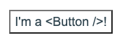 |
| React + styled-components | 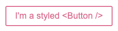 |
Storybook
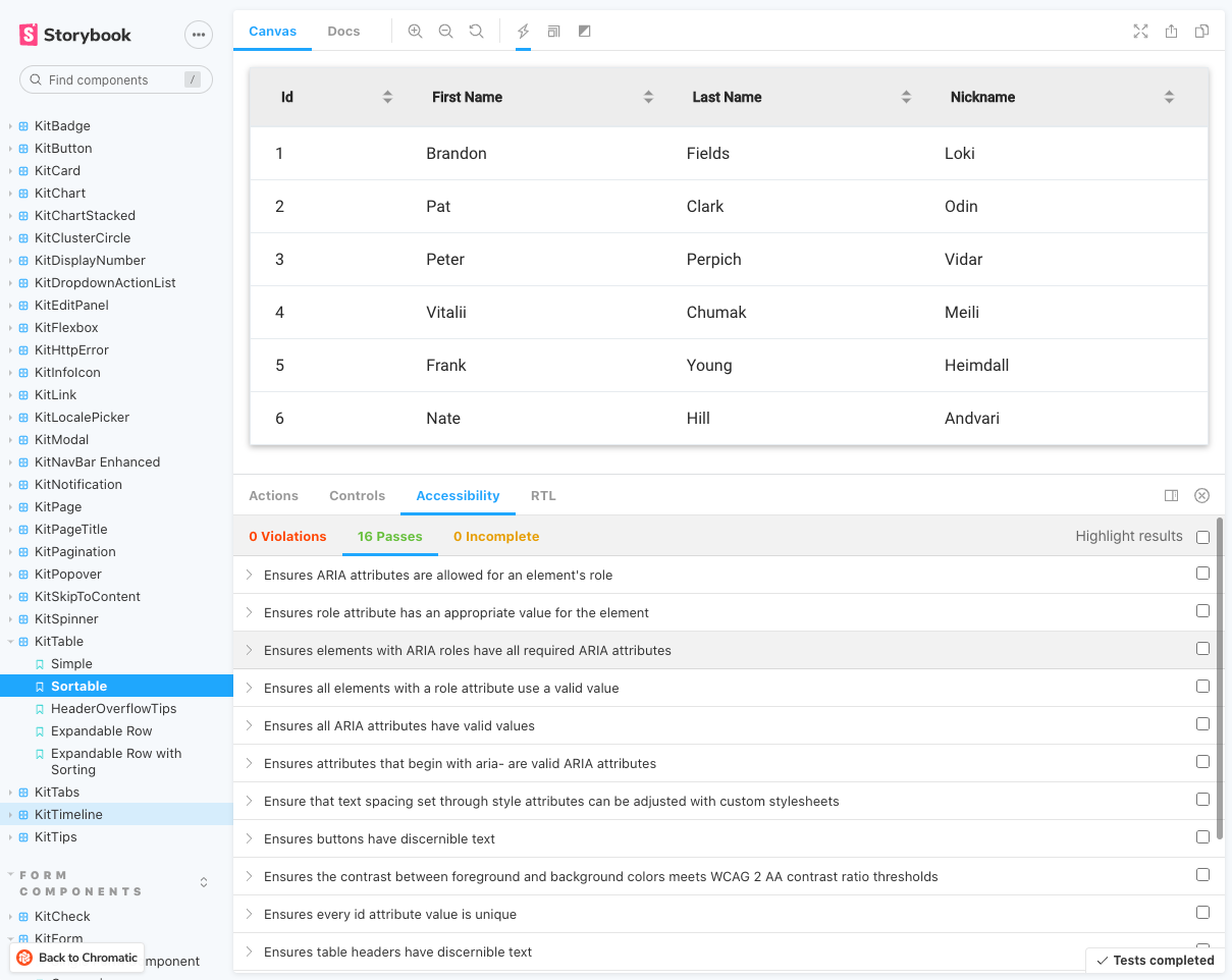
Storybook is an open-source tool for building UI components and pages in isolation. It streamlines UI development, testing, and documentation all in one sandbox. The Storybook sandbox allows us to build components and web page layouts in isolation so we can develop around hard-to-reach states and edge cases.
Early on, we made the decision to adopt Storybook to quickly write real-world use cases, or “stories,” for all components available in our shared cp-toolkit component library.
Each component can have multiple stories that will render in key states that can be tricky to reproduce in an app. We can also update props or mock data and see updates to the UX in real time.
Each component story shows how the component is used in a real-world scenario. This makes gathering feedback easy and shows how each component is meant to be used in an actual application or layout.
GitHub Actions and Chromatic
Using Storybook locally during development makes it easy for our software engineers to build and iterate quickly. The next step in our process involves review from our product and UX design teams.
Before developing cp-toolkit, we would set up meetings where the developer would run Storybook locally and screenshare with the team. Now, using GitHub Actions and Chromatic, our development team can simply open a GitHub pull request that automates the building and deployment of our Storybook to the cloud-based Chromatic platform, then send a link to the Storybook component running on Chromatic. Anyone can open this link to use the component in context and see real-time feedback.
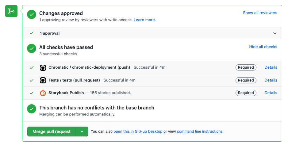
This simplifies getting feedback on our work from colleagues in the product and UX design teams. It’s also great for us software engineers, as we can review code and actually use the component to see if there are any issues. This has allowed our development team to find many issues that simply reviewing code within the team could have missed. After the developers, product and UX team have all approved the work, the web application is run through a thorough set of unit tests by our QA team.
What’s next
Cp-toolkit is still in the early stages of development here at ChargePoint, and we’re always looking for ways to improve our processes. We’ll continue to iterate and publish new versions as we come across new requirements in our ever-changing application landscape.
If this sounds interesting, we’re always looking to hire great people to join our engineering, product and user experience teams. Check out our open positions.